CrawlX
- client
- In-house product
- role
- Design, AI, Build
- year
- 2026
- live
- visit
An AI SEO crawler that turns 400+ raw technical checks into plain-English, prioritized fixes a whole team can act on.
context
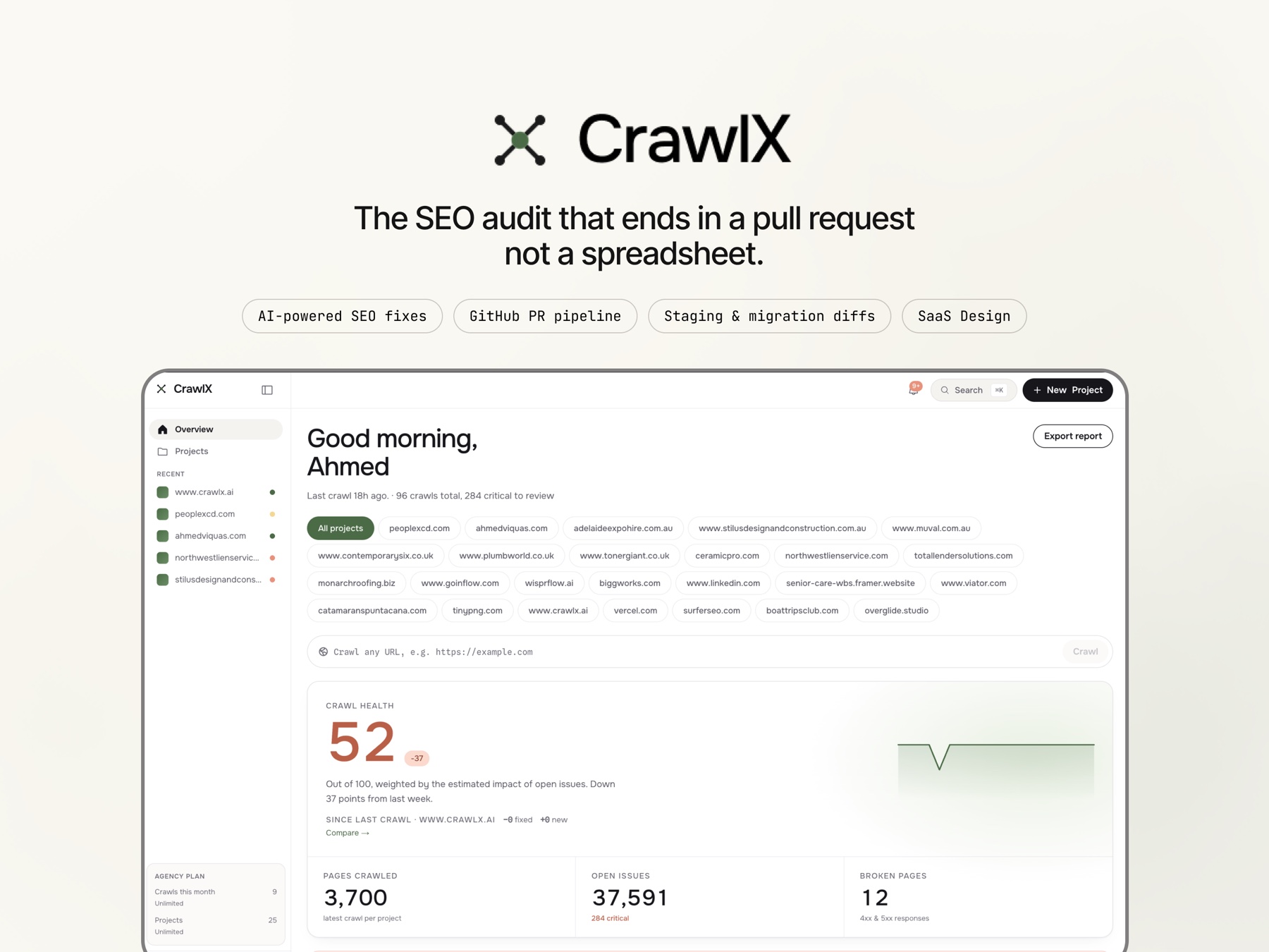
CrawlX crawls a website, finds its technical SEO problems, and explains each one in plain language with a suggested fix. I designed it from a blank page: the product, the interface system, and the brand. Then I built it, so the thing that shipped is the thing I drew. Owning both sides meant no design got value-engineered out in handoff, and no engineering constraint surfaced too late to design around.
The problem
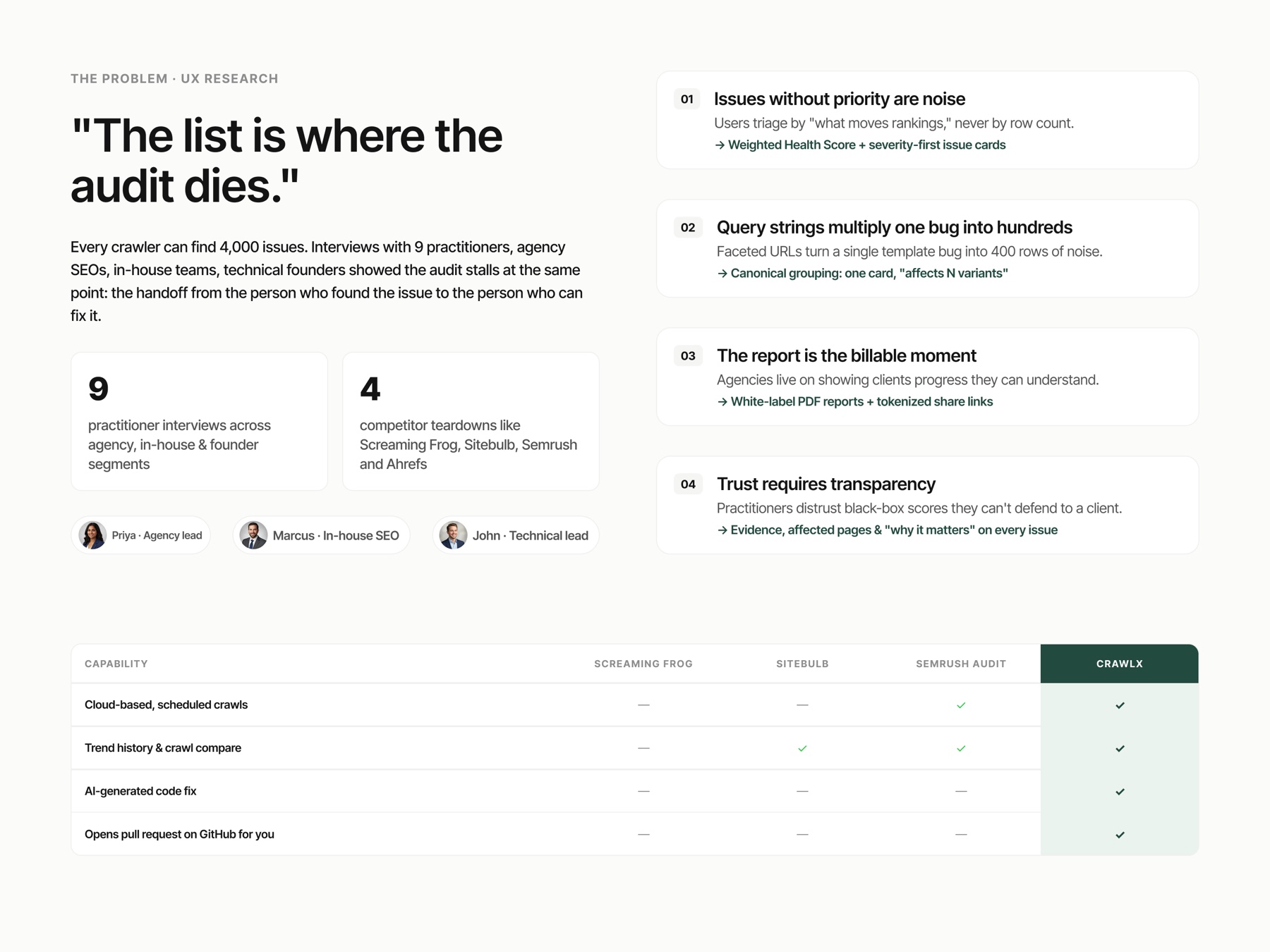
Technical SEO tooling is split into two unhappy halves. At one end sits Screaming Frog, the category default: a desktop app, powerful and trusted, but stuck in the 2010s. Dated interface, no AI, and a one-person, one-machine model. You cannot share a crawl, assign an issue to a teammate, or hand a client a portal. The knowledge lives on whoever ran the scan.
At the other end sit enterprise crawlers like Lumar: genuinely fast and capable, but 15,000 to 50,000 dollars a year, priced for a department, not a team. Between them, nothing. No tool offered enterprise crawl speed, a modern collaborative interface, AI built into the workflow, and pricing a small agency could sign off on. That gap was the entire thesis.
The design bet
Linear meets Datadog, for SEO. Linear for the craft and the calm, an interface that respects your attention. Datadog for the posture, a system that watches something complex and tells you what is wrong and where.
The bet underneath: an SEO crawler should not hand you a list of errors. It should tell you what each one means, why it matters, and how to fix it. Move the product from detection to decision. Screaming Frog answers what is broken. CrawlX had to answer what to do about it, and do it for a team, not a lone operator.
Designing calm out of 400+ checks
The hard design problem was never finding issues. Rust and 400+ checks find plenty. The problem was triage: a single crawl surfaces hundreds of problems at once, and the interface has one job, answer what do I fix first before the user feels the weight of the list.
So the whole information architecture is built to defend attention. One dataset, several lenses: the same issues re-framed for the operator triaging, the team assigning, and the agency reporting. Nobody gets handed the raw firehose.
- Every issue carries a plain-English explanation and a severity, never a bare error code. The explanation is the finding
- A Kanban issue explorer turns a static error list into work: cards you assign, move, and close, so a crawl becomes a queue you burn down
- A site-architecture visualizer shows where problems cluster, so a broken template reads as shape, not spreadsheet
- A white-label report builder turns the same data into a client deliverable, the moment a raw crawl becomes billable
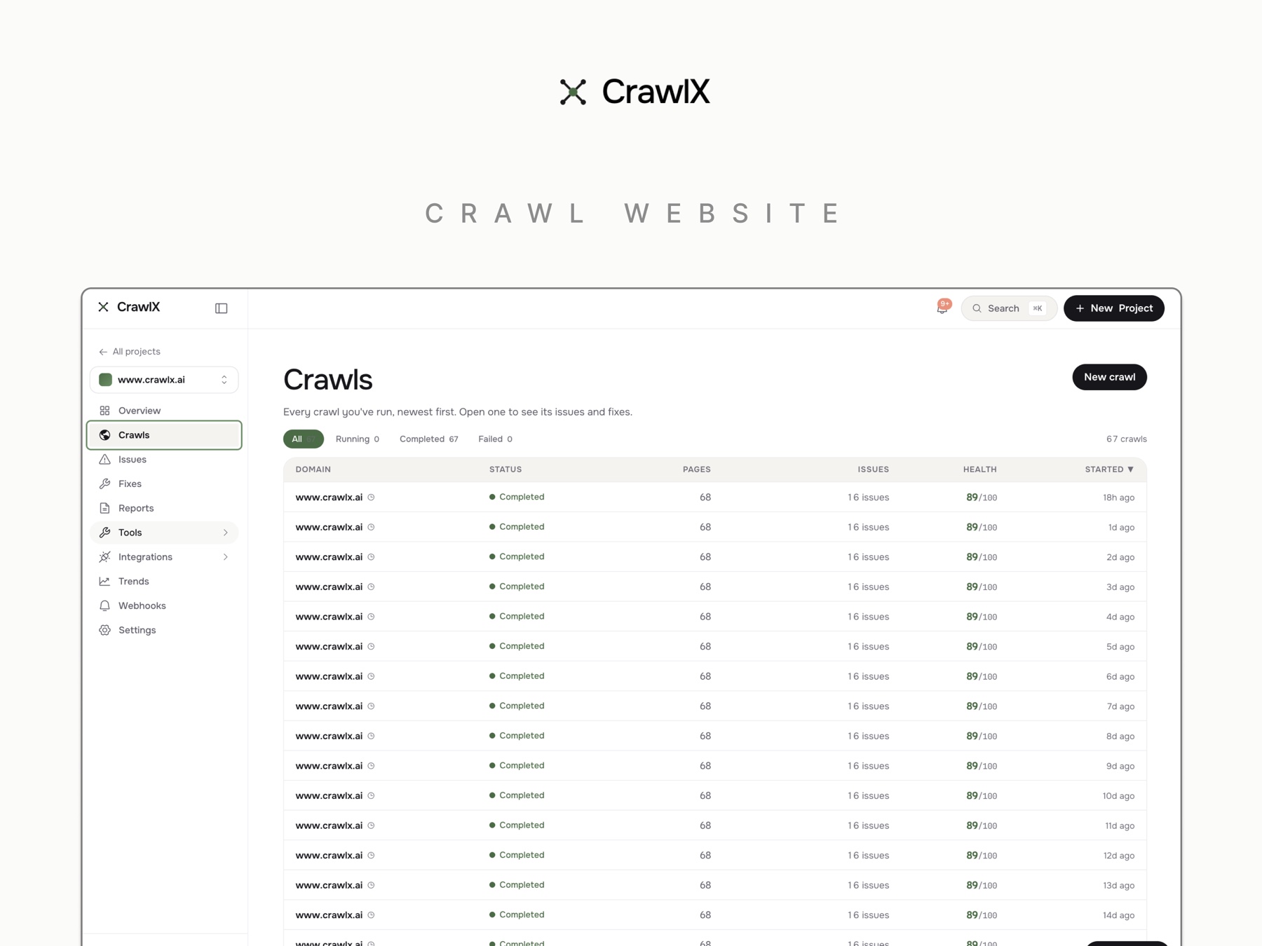
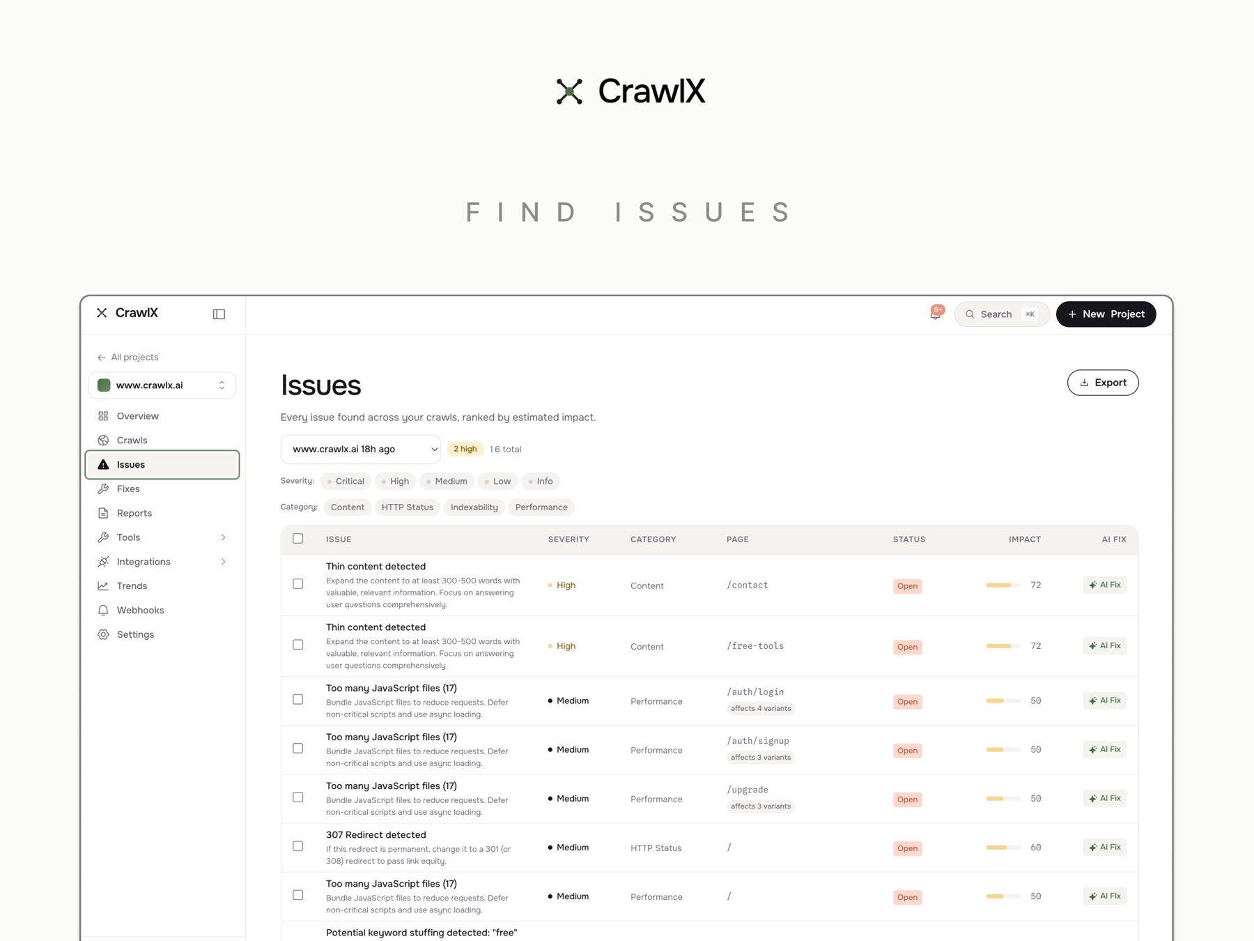
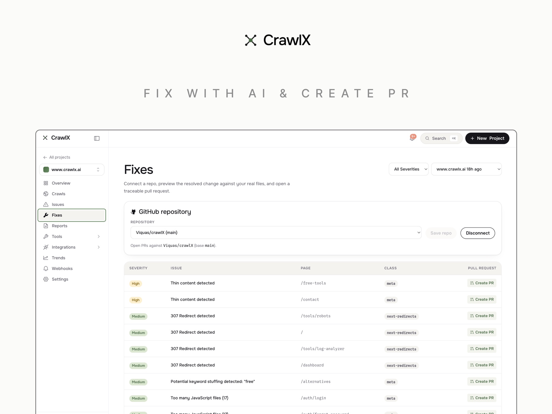
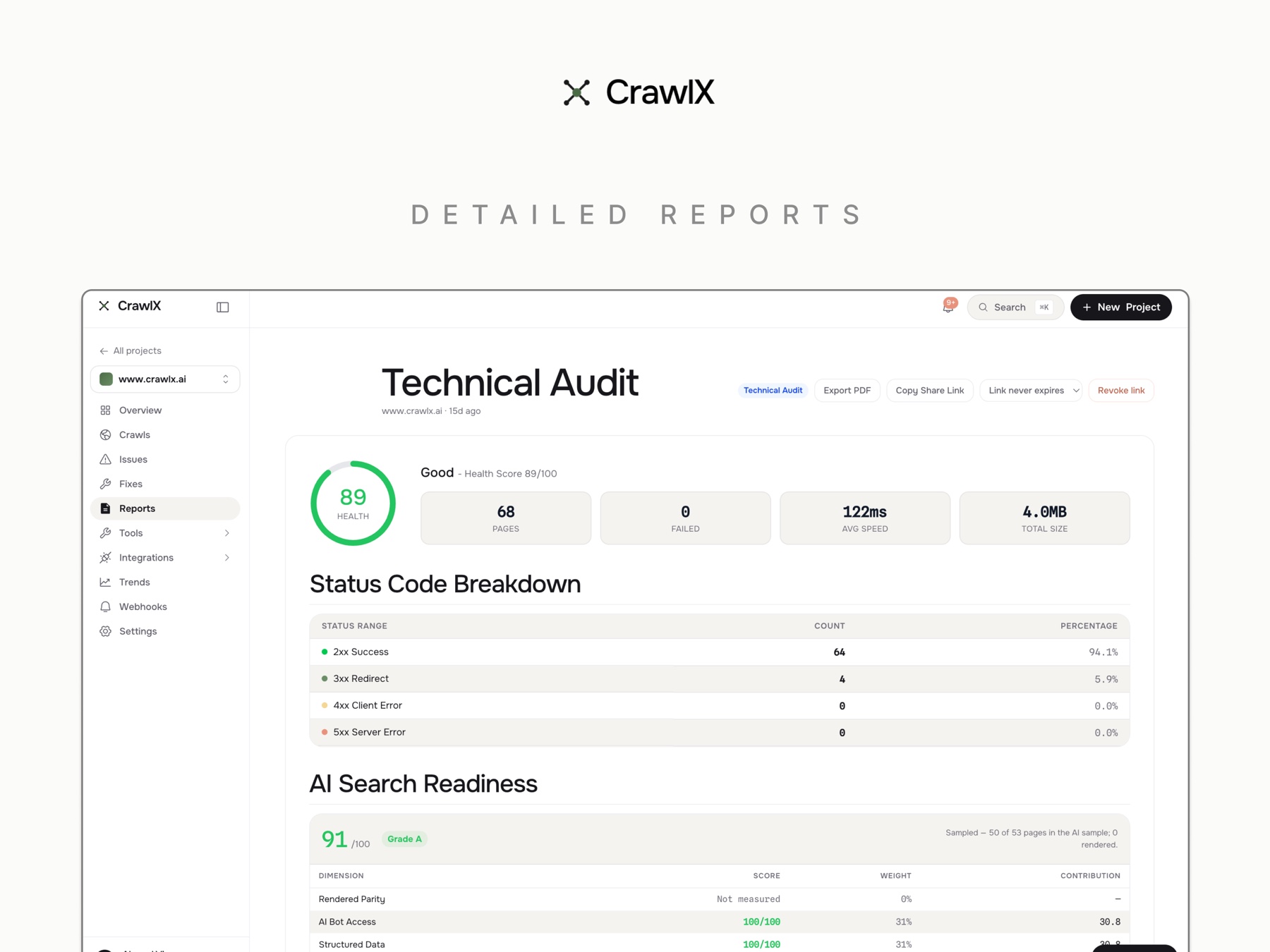
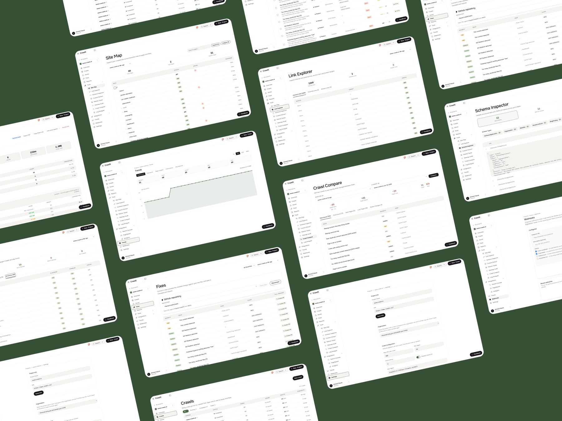
The screens
Six core surfaces, each a different altitude on the same data, from the single issue up to the whole site's shape.
- Live crawl view: watch the crawl happen in real time, so a long scan feels like progress, not a spinner
- Kanban issue explorer: triage and assign, the team's shared workspace
- Architecture visualizer: where the problems live, structurally
- Report builder: the client-facing, white-label output
- AI search-readiness module: checks whether pages are built to be cited by AI answer engines, a bet that SEO now means being legible to LLMs, not just Google. No competitor covers it
- Conversational assistant: scoped to your crawl, so answers are about your site, not the internet's average site
The AI layer, designed as UX
Most products bolt a chat box to the corner and call it AI. That is the thing I most wanted to avoid. In CrawlX, AI is not a destination you navigate to, it is woven into the moment the decision happens.
Explanations render on the issue, at triage time, where the what does this mean question is actually asked. Fix code is auto-generated in place, so the jump from understanding a problem to applying the solution collapses to one step. The assistant reasons about your pages, your issues, your architecture. The principle: AI should reduce the distance between noticing and acting.
Built to match the design
A design promise of fast, shareable, and team-first is only credible if the engine keeps up. You cannot design a live crawl experience on top of an engine that makes people wait. So the architecture is part of the design.
Rust crawl workers run at 350 to 450 URLs per second, which is what makes the live crawl view feel alive and re-crawling cheap enough to be routine. ClickHouse underneath handles billion-row crawl data without the interface ever feeling it, so the visualizer and issue explorer stay instant at scale. The result is the actual moat: enterprise speed and cost per crawl, at small-team pricing.
outcome
- 400+ checks across 12 modules
- 350 to 450 URLs per second, enterprise-class crawl speed
- A structural moat in speed and cost per crawl from the Rust and ClickHouse stack
- An AI search-readiness capability no competitor ships
- Designed and built end to end: brand, product, interface system, and engine
built with
Rust, ClickHouse, Next.js, Supabase, Claude API